One kit, one session.
Every family deserved their own.
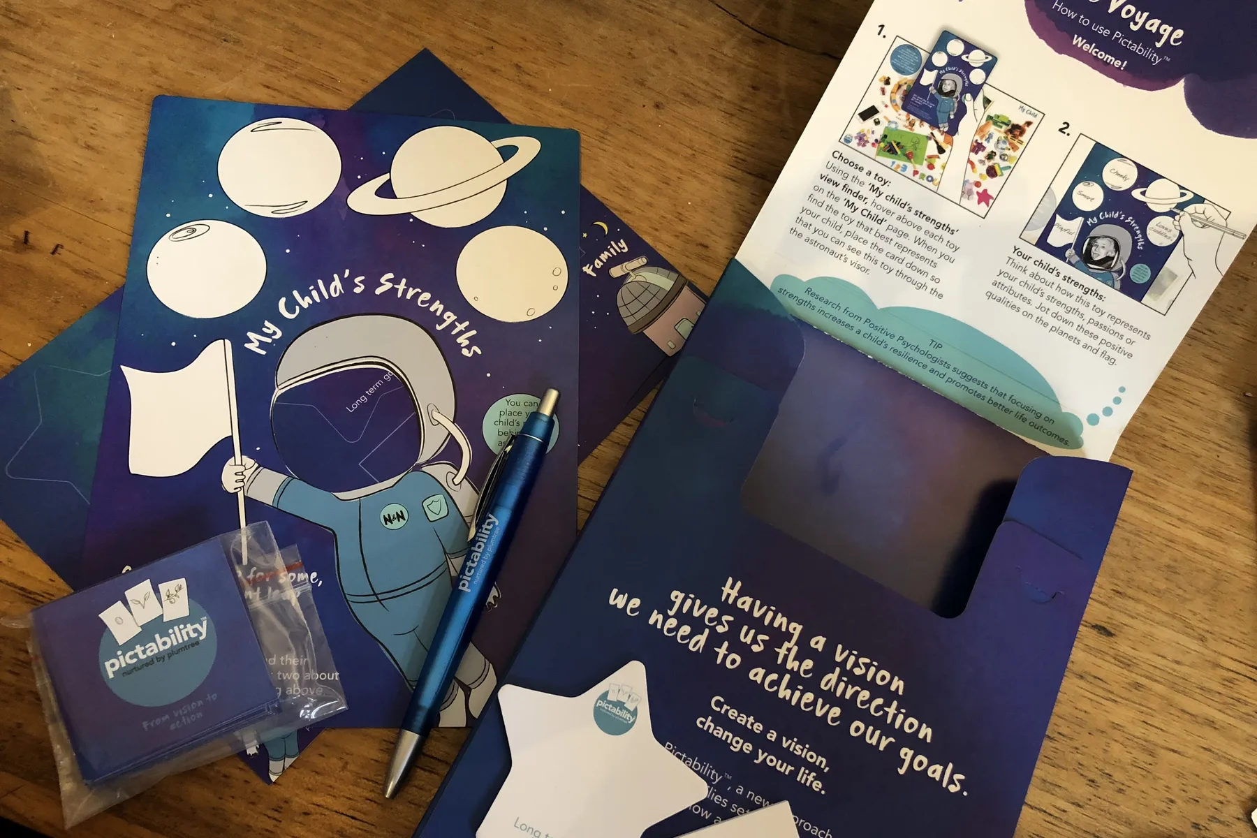
Plum Tree is an extraordinary not-for-profit organisation dedicated to supporting young children with disability and their families — empowering them to build a good life together. At the heart of their work was Pictability — a visioning tool built around connection through touch and visuals, designed to help families set goals and find a clear path forward.
It worked. Families responded to it. But there was one of it. A single physical kit that travelled from session to session, never going home with the families who needed it most.
Cost, production, accessibility, and the reality of the families using it — exhausted, often burnt out, many from culturally and linguistically diverse backgrounds — all had to be considered at every step.
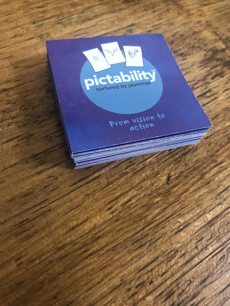
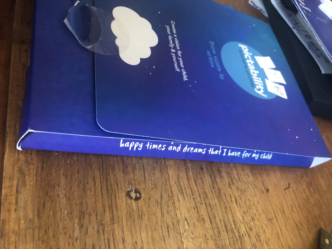
Every family deserved their own Pictability — something to take home, return to, and keep using long after the session ended. — Plum Tree · project brief
This wasn't one brief.
It was many iterations.
Pictability was refined over many years — rapid prototyped, tested with hundreds of families, and shaped by every piece of feedback that came back. That process was the work. Each round of testing surfaced something new: something that didn't land for a CALD family, something that was one step too complex for a parent running on empty.
Alongside the kit itself, we developed visual storytelling to walk families through the positive psychology frameworks that underpin Plum Tree's practice — complex psychological methods, translated into visuals that felt accessible and human rather than clinical.
A kit that any family
can use without instruction.
A printed kit product redesigned so that every family could have their own to take home, use independently, and return to over time. Every element was considered through the lens of the families using it: their lived experience, their capacity, their cultural context.
The box itself was further iterated to post efficiently — ensuring families anywhere could receive it without the product being compromised in transit. That practical consideration opened the door to reach far beyond a single organisation or region.
Over 2,000 kits distributed to families across Australia and internationally.
Accessibility wasn't a compliance checklist. It was the design brief.
Every decision was made with the understanding that the families using this kit were already carrying a significant load. The design had to reduce friction, not add to it.
CALD families were considered throughout — visual communication was prioritised over text wherever possible, so the kit could be navigated across language differences. The system was designed to support translation and wider access without needing to rebuild the core experience.
- Product design & development
- Visual communication
- Visual storytelling
- Co-design & HCD