Government strategy is dense
by design. The visuals can't be.
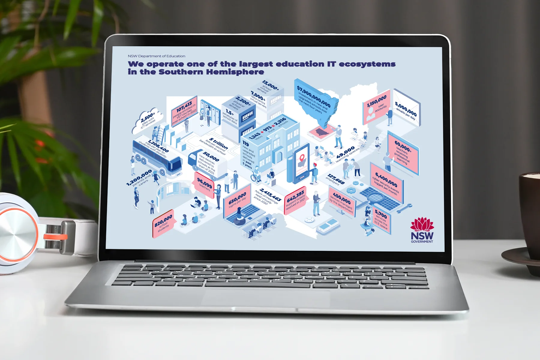
The NSW Department of Education's Digital Strategy 2026–2030 was a far-reaching plan packed with data, statistics, and complex systems that needed to land clearly with a wide range of audiences.
The brief was to translate all of that into something people could actually absorb: a stat-heavy infographic, infographic explainers to break down complex systems, and a series of visual diagrams — all within the strict brand guidelines of the Department of Education and NSW Government.
The challenge wasn't the volume of information. It was making that volume feel manageable without losing any of the rigour behind it.
The challenge was finding creative range within those boundaries — rather than working around them. — Jackie Streit · The Toy Cartel
When information is dense, find the right visual language to carry it.
We chose isometric-style graphics as the primary approach. Isometric illustration lets complex systems and layered information sit cleanly in a single frame — giving each element its own space without crowding the composition.
Throughout, every design decision was made within the DOE and NSW Government brand framework. The brief required strict adherence — and the challenge was finding creative range within those boundaries rather than working around them.

A suite of visuals that make
policy feel possible.
The stat-heavy infographic brought together the key data and figures in a format that could be read quickly and referenced easily — visually structured so the numbers told the story rather than being buried in it.
The infographic explainers used isometric-style graphics to map out the complex systems at the heart of the strategy — turning what could have been walls of text into clear, logical visual narratives. All outputs were delivered in compliance with NSW Government brand guidelines.
A complex government strategy made visually accessible to every stakeholder who needed to act on it.
When the visual explains, fewer words are needed.
When the visual itself explains the relationship between things, you don't need as many words doing that work — which is exactly what a dense government document needs. The goal was for the visuals to carry the load, so the reader wasn't overwhelmed before they'd even started.
All colour choices were verified against WCAG 2.2 AA contrast requirements within the NSW Government brand palette. Every isometric diagram was built with clear visual hierarchy, reducing cognitive load for readers at all levels of policy familiarity.
- Information design
- Data visualisation
- Visual communication
- Infographic design